
The Traveling Tokyo Orchestra
The Traveling Tokyo Orchestra
The Traveling Tokyo Orchestra
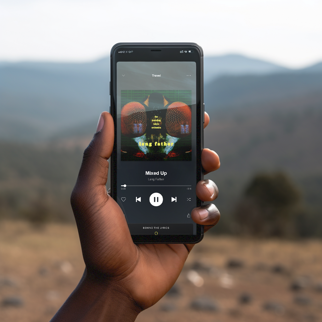
Creative direction for the static visual identity for the LP of producer and composer Lang Father
Creative Direction
Visual Design
The goal of The Traveling Tokyo Orchestra was to construct a body of ideas that are powerful, emotional, and maximal. As an LP, with deep textures and rich colors, it has its own flow and sound. It isn’t a landing place for vocals, but a unique collection of beats meant to stand alone.


The visual identity came from heightening fear. How can something moderately scary become disheartening? The inversion and enlargement of the fly, the reflection of The Shining twins, and the repetition of “who is coming” all tap into the feeling of discomfort.
Contributors
Lang Father | Artist